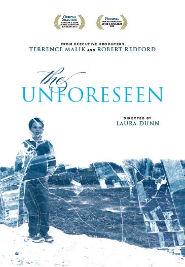
Negotiating our DVD artwork
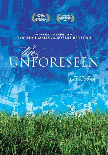
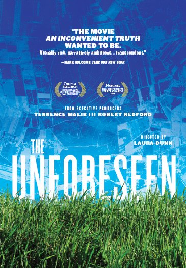
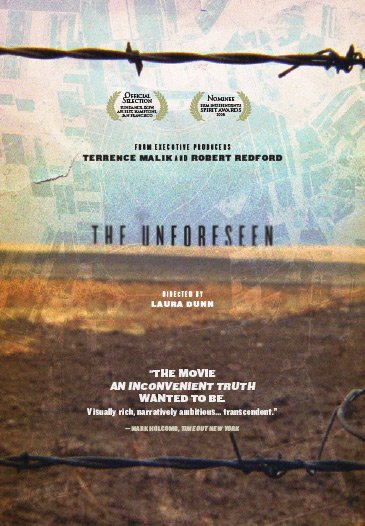
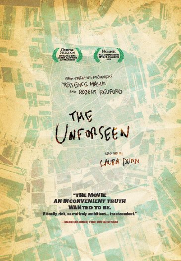
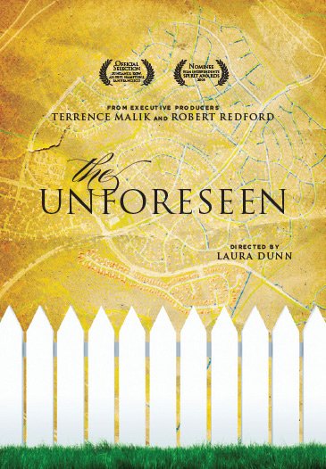
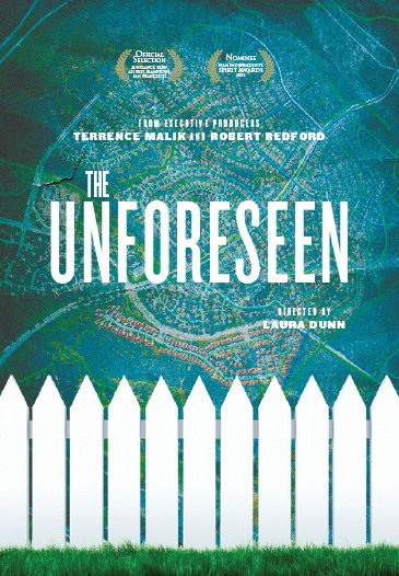
Originally, our distributor sent us their ideas for DVD covers (above.) We didn’t love them. I had a series of posters envisioned that juxtaposed Nature & Development. (Construction Crane vs Butterfly emerging from Cocoon, Spider Web vs Aerial of Subdivision Roads, etc.)
So I sent the proposed concept below for the cover.
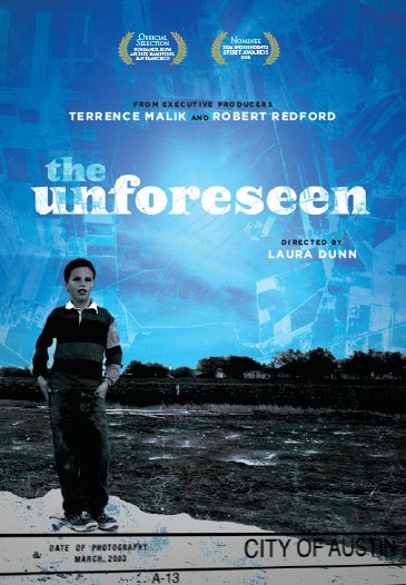
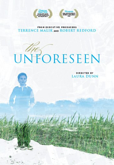
But distributor firmly wanted a House on the cover. I understood the reasoning, the Subprime Crisis had just started. But I never really loved the Cancer Map vs the Swimming Kid image that became the official cover.

